How we built a cricnepal design system that scaled design and development together
Nischal Tiwari
Website manager · Digital producer
cricnepal.com grew from a news blog into a live cricket platform — match centre, scorecards, player archives, ICC rankings. The interface multiplied faster than any one designer could hold in their head. Here is how a single source of truth let design and code move at the same speed.
By early 2026, cricnepal was no longer one product. It was an editorial site, a live scoring engine, a stats archive and a set of social-card templates — each shipping on its own clock. The visual language drifted a little with every new surface. We fixed it by building one system that design and engineering edit from the same place.
What was breaking
- The same button, card and tab existed in four slightly different versions across editorial and match centre.
- Colour lived as raw hex scattered through components — a brand tweak meant a find-and-replace across the codebase.
- Designers worked in a Figma file that no longer matched what the site actually rendered.
- Every new feature re-litigated decisions we had already made: which card? which tab style? how bold is too bold?
None of these are unusual for a product that grew organically. But each one taxed both sides at once: designers redrew components that already existed, and engineers rebuilt them slightly wrong. The cost wasn’t any single mistake — it was that design and development were drifting apart a few pixels at a time.
The goal we set was narrow and testable: change something once, have it land everywhere — in design and in code.
01 One source of truth, mirrored on both sides
We started by collapsing the brand into a token system rather than a screen library. The Figma file and the code share the exact same structure: tokens.css and input.css on the engineering side, mirrored as variable collections in Figma. The design file’s front page literally states it: “the same source of truth as the code.”
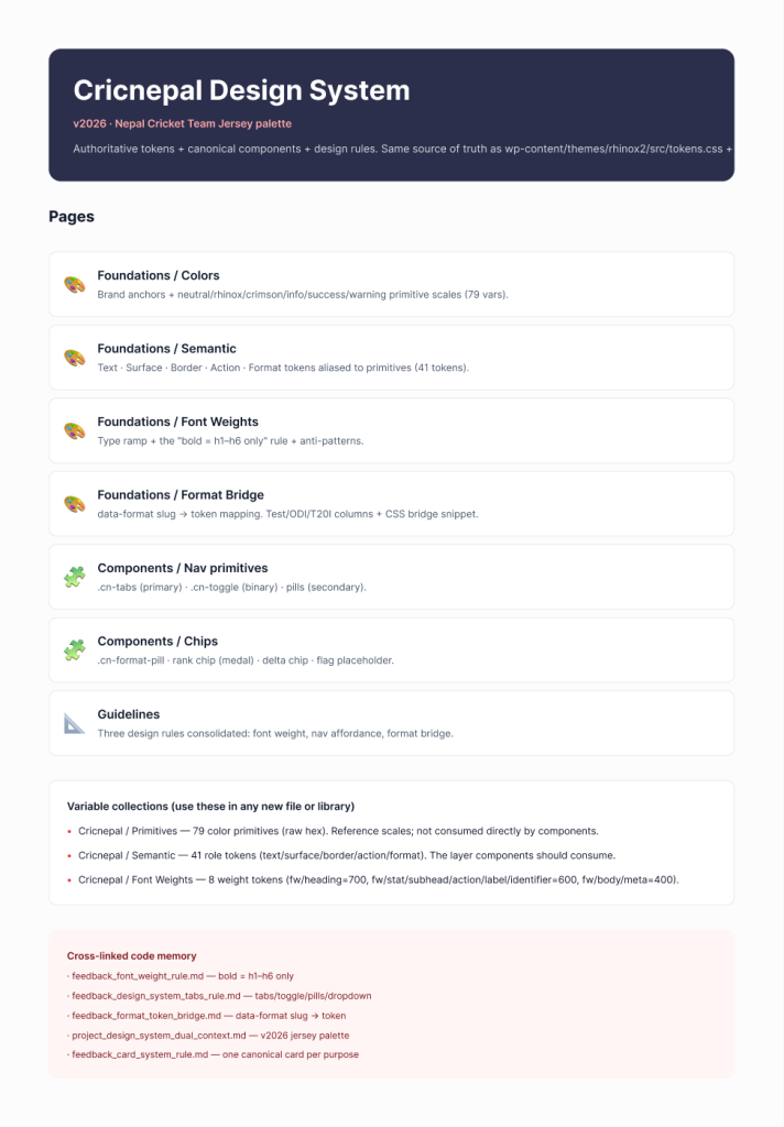
Tokens are layered in three tiers, and the layering is the whole point:
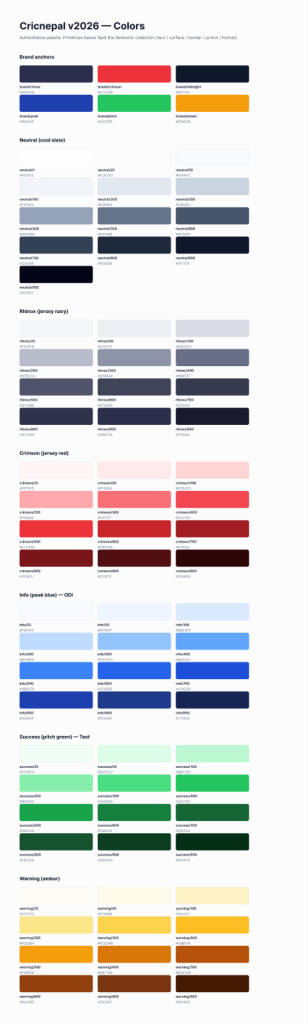
- 79 primitives — raw hex scales (neutral, brand, info, success, warning). Reference values only; no component ever reads them directly.
- 41 semantic tokens — role-based aliases like
--surface,--text,--border,--action-primary. This is the layer components consume. - 8 font-weight tokens — encoding a rule, not just a number (more on that below).
The brand anchors. Six fixed reference colours sit at the top of the primitive layer — the jersey navy and red lead, the rest map cricket meaning (formats, states).