From a Website Menu to a Personal Cricket Canvas
How I redesigned Cricnepal’s signed-in mobile navigation around identity, intent, and the habits people already bring from social apps
Nischal Tiwari
Website manager · Digital producer

How I redesigned Cricnepal’s signed-in mobile navigation around identity, intent, and the habits people already bring from social apps
Signing in should change how a product feels.
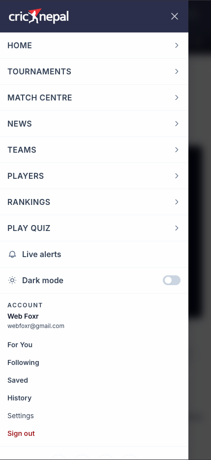
I kept returning to that thought while using Cricnepal on my phone. The account worked. Personalised feeds existed. Readers could follow topics, save stories, revisit their history, manage alerts and adjust settings. Yet opening the menu after signing in felt almost the same as opening it as a guest.
The drawer greeted me with the website, not with me.
My identity sat low in the hierarchy, below match links, alerts and appearance controls. The features that made an account worthwhile—For You, Following, Saved and History—appeared as a quiet list near the bottom.
Nothing was technically missing. But the experience did not feel personal.
That gap became the starting point for a redesign: not simply to make the menu prettier, but to make Cricnepal acknowledge the person who had signed in.
The clue was not a broken feature
This kind of problem is easy to overlook because every link can work in a usability test.
A reader can still find a saved story. They can still reach fixtures. They can still sign out. Measured one task at a time, the drawer is functional.
But products are also understood through hierarchy. Position, size, repetition and grouping tell people what matters before they tap anything.
In the old drawer, Cricnepal made an unintended argument: this is a cricket website, and somewhere inside it you have an account.
I wanted the signed-in experience to say something different: this is your Cricnepal, with the cricket world one step away.
Looking at familiar products without copying them
I compared the drawer with signed-in navigation on Facebook and X. Not because Cricnepal should behave like a social network, but because those products have taught millions of people a simple pattern: when you sign in, your identity becomes part of the navigation.
They tend to begin with a visible avatar, a recognisable name and a direct route to the user’s own space. Personal actions appear before general utilities. Icons and labels follow a predictable rhythm. Settings remain available, but they do not compete with everyday destinations.
The useful lesson was hierarchy, not feature count.
Cricnepal does not need creator tools, premium upsells, communities or AI assistants simply because larger platforms have them. Borrowing those features would create noise. Borrowing the convention that identity anchors a signed-in space, however, could make the product easier to understand.
That distinction guided the entire redesign: use familiar habits, but remain honest about what Cricnepal is—a focused home for cricket news, scores and the relationships readers build with teams, players and tournaments.
A visual problem revealed an architecture problem
Once I looked beneath the interface, I found a deeper inconsistency.
The drawer did not always contain the same primary navigation. On regular pages it used Cricnepal’s main menu. On a match overlay, it could replace that menu with a much smaller match-specific set: usually Live, Fixtures and Results.
The same hamburger button could therefore open two meaningfully different canvases.
For a guest who is casually browsing, that change may be tolerable. For a signed-in reader, it weakens the mental model of “my things.” Saved stories should not become harder to reach because the reader happens to be checking a scorecard.
There was another clue. Cricnepal’s account pages already had a stronger expression of identity: an avatar, a greeting, navigation tabs and profile controls. The global drawer independently rebuilt a thinner version of the same person.
The product had the right ingredients. They were simply arranged differently across surfaces.
I reduced the audit to four problems:
- Identity was buried. The reader appeared after global navigation and utilities.
- Different kinds of actions looked alike. Cricket links, personal content, settings, alerts and sign-out shared one loose hierarchy.
- Navigation changed with page context. A match page could reduce the drawer to a match menu.
- The account model was duplicated. The global header and account area represented the same user in different ways.
At that point, changing colours and spacing would have been cosmetic. The information architecture had to change.
Account-first, not account-only
The redesign needed to respect two truths at once.
A signed-in canvas should begin with the reader. But people still come to Cricnepal for cricket.
An account-only drawer would have been as limiting as the old site-only drawer. Hiding fixtures, results, teams, tournaments and news behind extra steps might make the interface look minimal while making it less useful.
So I organised the drawer around five questions a person is likely to ask, in order.
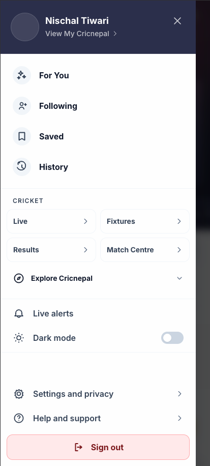
1. Who is signed in?
The new header begins with the reader’s WordPress avatar, with initials as a dependable fallback. The name receives the strongest typography in the drawer. A clear View My Cricnepal affordance makes the destination explicit, and the whole identity block acts as a route into the personal area.
I removed the email address from this prime position. Email is useful account-management information, but it is rarely how somebody experiences their identity. It still belongs in settings; it does not need to compete with the person’s name every time the drawer opens.
2. What is mine?
The four highest-value personal actions now follow identity:
- For You
- Following
- Saved
- History
Each action uses the same icon-and-label pattern, spacing rhythm and touch target. The consistency matters. A reader can scan these destinations as a set instead of decoding a loose list one line at a time.
3. Where can I explore cricket?
Cricket destinations have their own labelled section. Live, Fixtures, Results and Match Centre stay visible because they represent the strongest recurring intent.
Secondary destinations sit inside an Explore Cricnepal disclosure. This reduces the initial density without removing access. Match shortcuts and the main navigation are combined and deduplicated, so a scorecard no longer erases the reader’s stable personal hierarchy.
4. What can I control?
Live alerts and dark mode now sit together as product controls rather than pretending to be destinations. Dark mode keeps a visible switch and an accessible checked state.
This is a small structural change, but it makes the drawer easier to read: links take you somewhere; controls change how the product behaves.
5. Where do I manage my account?
Settings, privacy, help and support settle near the bottom as quieter secondary actions.
Sign-out receives its own full-width treatment, including an icon, contained background and direct label. It is easy to find and difficult to confuse with ordinary navigation, without becoming the loudest item on the screen.
Why guests see a different hierarchy
I deliberately avoided forcing one drawer structure onto everyone.
For a guest, the website is still the right organising principle. The logged-out drawer remains brand-led and site-first, with a clear sign-in action.
For an authenticated reader, the order changes. Identity leads. Personal destinations follow. Cricket exploration becomes its own section.
This is not inconsistency. It is the interface responding to state.
Authentication should do more than unlock hidden routes behind the same shell. The value of signing in should become visible in the way the product reorganises itself around the reader.
Turning the design into a stable system
The implementation lives in Cricnepal’s shared React header, which serves both regular pages and match overlays. That made the work more sensitive than the size of the drawer might suggest: a mistake in global header state can travel across almost the whole reader application.
The engineering work included:
- separating authenticated and guest drawer layouts;
- promoting the account identity block to the top of the signed-in canvas;
- extending the private account response with a WordPress avatar URL when a real avatar exists;
- defining a typed icon model for personal and account-management destinations;
- converting personal links into consistent icon-led rows;
- combining match shortcuts and global navigation into one deduplicated collection;
- showing four high-intent cricket links and placing secondary destinations in an accessible disclosure;
- retaining live-alert, theme, scroll-locking and modal behaviour;
- preserving semantic navigation labels and switch states for assistive technology;
- sharing the same account-link source with desktop navigation; and
- treating sign-out as an explicit destructive action rather than detached red text.
I stayed inside Cricnepal’s existing colour tokens, spacing system, type scale, borders and dark-mode surfaces. A navigation redesign should strengthen the design system, not create a second visual language inside it.
Rows retain touch-friendly heights. The drawer scrolls on shorter screens. Secondary account actions naturally settle toward the bottom when space allows.
These details are not decorative polish added after the “real” design. They are the design.
What I validated—and what I did not
Because the header is global, I checked the change with the repository’s design-system lint, TypeScript validation and a full optimised Next.js production build.
That covered account and match routes, archives, entity pages and the rest of the reader application. The checks confirmed that the design tokens were used correctly, navigation data remained type-safe, production compilation succeeded and existing destinations for accounts, alerts, theme and sign-out remained intact.
What those checks cannot prove is that readers will use the drawer more.
I do not want to turn design confidence into invented evidence. The next questions belong to real behaviour:
- Do more drawer opens lead to For You, Following, Saved or History?
- Does the time from opening the drawer to selecting a destination fall?
- Are there fewer immediate closures or mis-taps?
- Do signed-in readers return more often?
- Does behaviour differ between match pages and editorial pages?
The success criterion is not “the drawer looks better.” It is whether readers discover and use the value of their account more often.
The change was conceptual
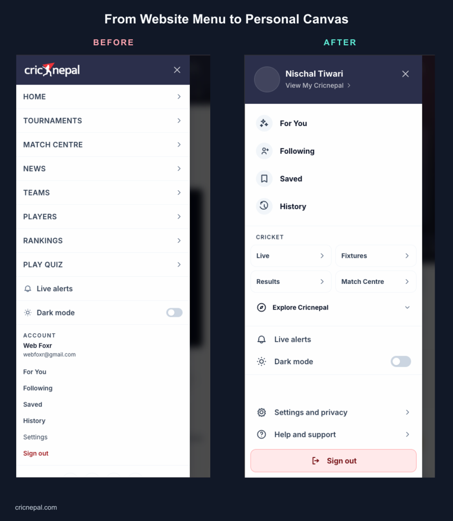
Before the redesign, the mobile drawer behaved like a website sitemap with account features appended.
After the redesign, it behaves like a personal product surface. The reader is visible immediately. Personal destinations are scannable. Cricket navigation remains close and consistent. Match context no longer erases the personal hierarchy. Controls and account-management actions have clear roles. Guests still receive a site-first experience that makes sense for them.
The most important shift is not visual. Cricnepal no longer treats authentication as a small section inside navigation. The navigation itself responds to authentication.
What this work taught me
A feature can exist without feeling available
Saved stories, followed teams, history and personalised feeds were already built. Their weak placement made them feel less substantial than they were.
Information architecture is part of feature delivery.
Consistency matters more after sign-in
Anonymous readers often browse page by page. Signed-in readers begin to form a stable idea of “my things.” Those destinations need to survive changes in content and context.
Familiar products are pattern libraries, not templates
Facebook and X were useful because they demonstrated a learned behaviour: identity can be navigation. Their visual style and sprawling feature sets were not the answer.
Every menu makes an argument
A menu is never just a list. It tells people what the product believes is important.
By placing For You, Following, Saved and History directly below identity, Cricnepal makes a clearer argument for an ongoing relationship with the reader—not just a single page view.
A small drawer, a larger direction
This redesign is one feature, but it hints at a broader direction for Cricnepal.
A modern sports product is more than a stream of articles and scores. It can become a personal layer over a live sporting world. Readers follow teams and players, save stories, return to matches, receive alerts and build habits around competitions.
The interface should make that relationship visible.
The goal was never to turn Cricnepal into Facebook or X. It was to take one durable lesson from products people already understand—the person belongs at the centre of a signed-in experience—and apply it to a focused cricket platform.
The result is more than a tidier menu.
It is a clearer idea of what My Cricnepal should feel like.