The $79K menu: making the business case for interactive email navigation
A national charity's email menu was quietly earning six figures a year — but a third of its audience couldn't see it. Here's how I found the gap, proved it with analytics, and built a CSS-only fix for it.
Nischal Tiwari
Website manager · Digital producer
Most email design conversations start with the hero image. This one started with a navigation bar nobody was looking at.
I was working as an eDM developer in the marketing automation team at World Vision Australia, building and shipping supporter email campaigns. Our emails carried a small header menu — the logo, plus three links: Ways to Give, Where the Funds Go, and About Us. Standard stuff. It had been there for years.
On desktop, it worked fine. On mobile, it simply wasn’t there.
That’s a common decision in email. Screen space is scarce, navigation is a nice-to-have, and the safest thing to do with a mobile header is strip it back to a logo. Nobody had made a bad call. But I had a hunch it was costing us something, and I wanted to know how much.

Step one: find out what the menu was actually worth
Before proposing anything, I pulled the Google Analytics data for every click that originated from the email menu, across a full year — 30 April 2018 to 30 April 2019 — and traced it through to donations on the website.
The number surprised everyone, including me.
Those four menu components generated $79,000 in donations over twelve months.
Broken down by link:
| Menu item | Revenue |
|---|---|
| Ways to Give | $51,047 |
| World Vision logo | $24,153 |
| Where the Funds Go | $2,765 |
| About Us | $1,017 |
A menu bar that had never been anyone’s priority was quietly out-earning entire campaign elements that got weeks of design attention.
Step two: find the gap
Then I split the same revenue by device.
| Device | Traffic | Revenue | Share |
|---|---|---|---|
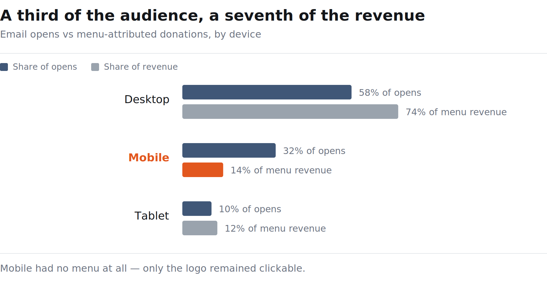
| Desktop | 3,068 | $58,563 | 74% |
| Tablet | 641 | $9,028 | 12% |
| Mobile | 686 | $11,316 | 14% |
Desktop dominated. That looks unremarkable until you put it against how people were actually opening our email:
- 58% of opens came from desktop clients
- 32% came from mobile devices
- 10% came from tablets
So roughly a third of our audience was opening on a phone — and being served no navigation at all. The $11,316 attributed to mobile was coming almost entirely from the logo link, which was the only clickable header element that survived the mobile breakpoint.
That reframed the whole thing. This wasn’t a design tweak. It was a third of the audience being shown a worse version of something we already knew converted.
Step three: work out what’s technically possible
Interactive email was having a moment around then — Litmus and others were shipping in-email checkouts, accordions, carousels, hotspots. The umbrella term was “kinetic email”: using CSS transitions and state to deliver content inside the message rather than pushing everyone to a landing page.
The relevant technique here is a hamburger menu, and it hinges on one trick: a hidden checkbox and its label.
Email clients strip JavaScript — all of it, without exception. But some clients support CSS well enough that you can fake interactivity using the :checked pseudo-class. You place an invisible checkbox in the markup, style a <label> to look like a hamburger icon, and point the label at the checkbox with a for attribute. Tapping the label toggles the checkbox. Your CSS reacts to :checked and reveals the menu.
The structure looks roughly like this:
The <form> wrapper isn’t decorative. Some clients discard form controls that aren’t inside a form, and wrapping the interaction keeps the checkbox intact through more rendering engines than leaving it bare.
Step four: be honest about where it breaks
This is the part that gets skipped in most interactive email write-ups, and it’s the part that decides whether the feature is safe to ship.
The technique works on Apple Mail across iOS and macOS. It works on some Android builds. It does not work in the Gmail app — on either platform — because Gmail’s renderer strips the elements the toggle depends on.
That could have killed the proposal. It didn’t, for one reason: I checked what our supporters were actually using.
Of the people opening our email on a mobile device, 56% were on Apple, against 11% on Samsung. The audience skewed heavily toward exactly the clients where this works.
So the design principle became progressive enhancement, not feature parity. Where the client supports the toggle, users get an app-like collapsible menu. Where it doesn’t, the markup degrades to a plain mobile menu, or hides cleanly — no broken layout, no orphaned checkbox, no visible failure. Nobody gets a worse email than they had before. Some people get a better one.
That distinction is what made it approvable. A feature that only works for 56% of mobile users sounds like a compromise. A feature that adds something for 56% of mobile users and costs the rest nothing is just an improvement.
What I actually pitched
I put the whole thing in front of the marketers and the creative team as a short deck. Not a design mockup — a business case:
- This menu earns $79K a year.
- 74% of that comes from desktop. Mobile is a third of our audience and gets no menu.
- Here’s the technique that fixes it, and here’s precisely where it works and where it doesn’t.
- 56% of our mobile audience is on clients where it works.
- This is a missed opportunity, not a design preference.
The ask at the end was deliberately small: approval and prioritisation, plus a designer’s time to make it look like it belonged. It went through.
What I’d tell anyone doing this
Find the number before you design anything. The menu was invisible as a priority precisely because nobody had ever attributed revenue to it. Ten minutes in Analytics turned a nice-to-have into a business case. Design opinions get debated. Attribution data gets acted on.
Check your own audience, not the industry average. Every article about interactive email includes a support matrix. None of them know what your supporters use. The 56%-on-Apple figure is what turned “this doesn’t work in Gmail” from a blocker into a footnote.
Design for graceful degradation and say so out loud. Stakeholders get nervous about email techniques that don’t work everywhere — reasonably so, given how many ways email can break. Showing them the fallback state is usually what unlocks the yes.
Small surfaces compound. A header menu is four links and maybe 60 pixels of vertical space. Across a year of campaigns, it was worth more than most of the things we spent design cycles arguing about.
Written up in 2022, covering work delivered at World Vision Australia. Revenue and device figures are from the Google Analytics reporting period 30 April 2018 – 30 April 2019.